
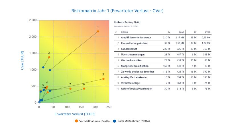
Risk maps are under criticism. Rightly so. But you don't have to throw them away. Risk maps are among the most widespread communication tools in risk management. Almost everyone knows them. Almost everyone understands them. And that is exactly why they are used. The criticism of them is well known, and justified on many points. One central point: In classic risk maps, essential properties of risks get lost. Risks are not points. Risks are distributions. Whether a risk has rare extremes, whether it is strongly skewed, whether high losses are typical or only theoretically possible: all of this remains invisible in many risk maps. Two risks can sit at the same point even though they differ fundamentally from a risk perspective. The problem here is not the chart. The problem is what feeds the chart. Historically, that was understandable. When there were no simulations, no aggregation, and no powerful tools, risks had to be assessed roughly. Ordinal scales and categories were a pragmatic way to make uncertainty communicable at all. Today this limitation is no longer necessary. We have therefore deliberately kept the familiar concept of the risk map, but rebuilt it methodically from the ground up. Our risk map is a scatter plot whose axes show statistically clearly defined quantities, for example: • Expected loss • Conditional Value at Risk (expected worst case) Both quantities can be calculated for any risk, regardless of the shape of the distribution, skew, or occurrence mechanics. And they arise automatically from the simulation, without additional assumptions, without manual assessment. The result: The chart stays familiar. The information gets better. And because the axes can be freely chosen, there is not just one risk map, but different perspectives on the same risks, depending on the question, the decision situation, or the steering need. Risk maps do not have to be a blunt instrument. They can be a clean, connectable steering tool, if you feed them with the right information. We implement exactly this approach in Risk Kit and in the Enterprise Risk Evaluator (ERE): risk maps as an understandable condensation of simulation results, connectable to existing reporting and decision routines.
This post was originally published on LinkedIn. View and join the discussion there