
1. Distributions for the Occurrence of the Risk
Distributions that model the occurrence side of a risk count how often the risk actually materializes within a period.
In principle, any distribution that takes the counting numbers 0, 1, 2, 3, and so on as its values can be used for this. In practice, however, essentially three distributions are discussed, and only two of them are actually used. These are the Bernoulli, the Poisson, and the binomial distribution, of which the first two find practical application.
1.1. Bernoulli Distribution
The Bernoulli distribution is the classic occurrence model in enterprise risk management. Its standing dates back to the time when a risk was represented by a probability of occurrence and an impact, in each case just two numbers. The original use case was very specifically described operational risks viewed over a single period.
The Bernoulli distribution describes a generalized coin toss. There are exactly two states. An event ('heads', or translated to our case, 'the risk materializes') either occurs or it does not. Multiple occurrences are not possible.
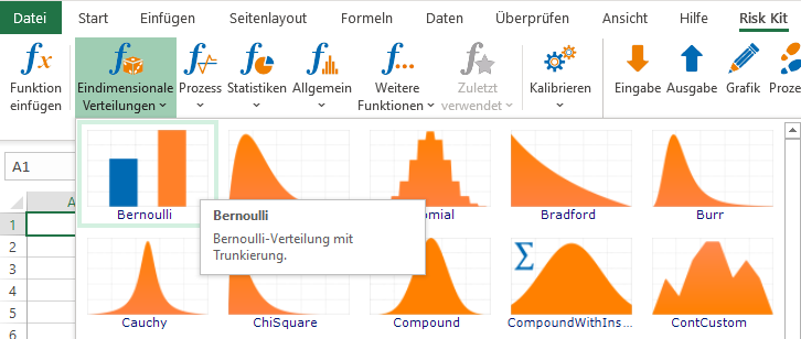
Figure 1: The Bernoulli distribution on the Risk Kit ribbon
The distribution has one parameter, the probability of occurrence P of the risk under consideration.
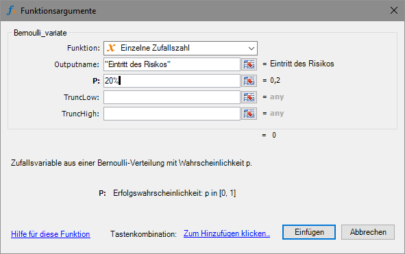
Figure 2: Input dialog for the Bernoulli distribution in Risk Kit
The probability of occurrence (PO) is, in most cases, determined by expert assessment in ERM. This is also necessary because ERM includes many risks in the analysis that have not yet occurred in everyday business but are considered possible.
If risk experience is available within the company, the PO can also be estimated as the number of observed occurrences of the risk divided by the number of years observed. So if, for example, the risk has occurred twice in the last 10 years, this logic would put the PO at 20%.
To broaden the scope of risk knowledge, it is certainly possible to draw on experience from the market as well. If a risk has occurred at other companies, that may well be a strong argument that it could also occur in your own company.
Analyzing data to determine the probability of occurrence becomes more reliable the more representative occurrences of the risk are available. It becomes more difficult and more error prone the more rarely the risk occurs. In the extreme case where the risk has never occurred at all, you cannot reach a result without expert assessments.
In the simulation, the Bernoulli distribution takes the values 0 and 1. The 1 represents the occurrence of the risk.
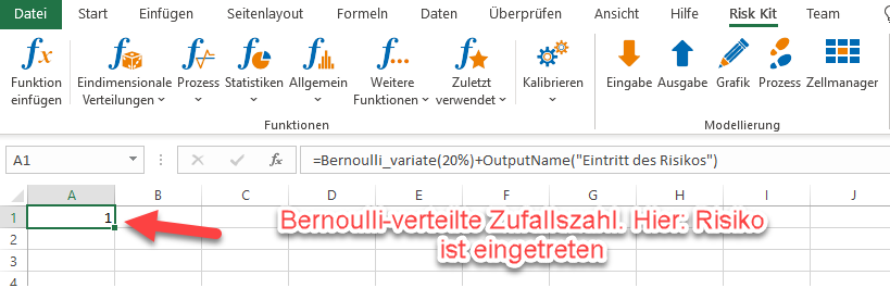
Figure 3: Bernoulli-distributed random number
This property of the Bernoulli distribution, that a risk can occur either not at all or exactly once, but never more than once, is a key criterion for its use.
In many ERM models that look at how risks develop across multiple periods, the Bernoulli distribution creates an inconsistency in the model. In multi-period models, the occurrence of the risk is simulated in every period. If a Bernoulli-distributed risk occurred in period 1 in a given simulation run, that risk is blocked for the rest of the period and cannot occur again. But as soon as the next fiscal year (period 2) begins, the risk is unlocked again and can occur once more starting in January.
The same contradiction arises when periods are split. If you switch a Bernoulli model from an annual to a quarterly view, the risk can suddenly occur up to four times as often over the original one-year span as before. Conversely, if you move to a 5-year view, for example for strategic risks, the risk will occur less often, even if the probabilities of occurrence are correctly adjusted for the changed time periods.
The Bernoulli distribution as a model for the occurrence of a risk is best suited to cases where that risk can only ever occur once, regardless of how the periods are defined.
For the original use case of 'specific operational risks with a single-period time horizon', this criterion is very well satisfied. A specific product is taken off the market only once. A named bridge collapses only once, and so on.
This changes for more generally formulated descriptions of operational risks, such as 'one of our products has to be taken off the market' or 'a delivery route becomes impassable and the supply chain is disrupted.' The same applies to broader risk concepts.
An extension of the modeling of risk occurrences therefore allows for multiple occurrences of a risk within a period. The two most important tools for this are the binomial and the Poisson distribution.
Mathematically speaking, the Bernoulli distribution is the building block from which these two (and many other) distributions are constructed. It is therefore a direct generalization.
1.2. Binomial Distribution
A binomial distribution arises when we carry out a fixed number n of Bernoulli experiments, each of which can only result in 0 or 1 (success or failure, the risk fails to occur or the risk occurs).
The total number of successes across n trials takes a value among the counting numbers 0, 1, 2, ..., n.
Example: If I operate a wind farm of 8 wind turbines and cannot simply replace a turbine, anywhere from 0 to 8 turbines can fail at the same time.
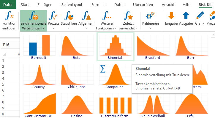
Figure 4: The binomial distribution on the Risk Kit ribbon
The binomial distribution has two parameters: the number of trials n and the probability of success in each trial p.
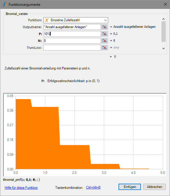
Figure 5: Input dialog for the binomial distribution

Figure 6: Binomially distributed random number
An important assumption of the binomial distribution is that the probability of success stays the same for every experiment. In practice, this can hold true, but it can also be a limitation.
In the wind farm example, the assumption of equal probabilities of occurrence for the risk of a turbine failing would be well satisfied if the turbines were very similar in model, load, and age. But if the farm is a mix of smaller and larger turbines of different types and different operating histories, it may be more realistic to treat each turbine as its own separate risk.
The binomial distribution as a model for the number of turbine failures would also not be ideally suited if a turbine failed only temporarily and returned to production after repair. In that case, individual turbines could fail more than once, and in some cases more failures could occur than there are turbines in the farm.
In a multi-period model, using the binomial distribution can create a dependency between periods if the maximum frequency of occurrence in one period changes based on the number of losses in a prior period.
If, in the example, two wind turbines failed permanently in period 1, only 6 of the original turbines would remain for the time being in the following periods, so the value of n would have to be reset here. Additional losses would further reduce the number of turbines still intact.
By breaking the risk down into one risk per turbine, which is permanently dismantled once it fails, this case can also be simplified in the same way as above, so that the dependencies over time arise on their own.
Because of these complexities, and because of the general option of splitting the risk into risks with Bernoulli-distributed occurrences, the binomial distribution is very rarely used to model the frequency of occurrence of risks in ERM.
In ERM, because the model is used company-wide and a large number of people are involved, a certain degree of standardization of the model components is generally desired.
In technical models of large installations, it is different. Here, detailed representations of smaller, internally homogeneous groups of equipment, as described in the wind farm example, are a standard element in which the binomial distribution plays a central role.
1.3. Poisson Distribution
If an event occurs over a period of time with a constant probability, its 'intensity', and these occurrences are independent of one another, its frequency of occurrence is Poisson distributed.
It takes values among the counting numbers 0, 1, 2, and so on.
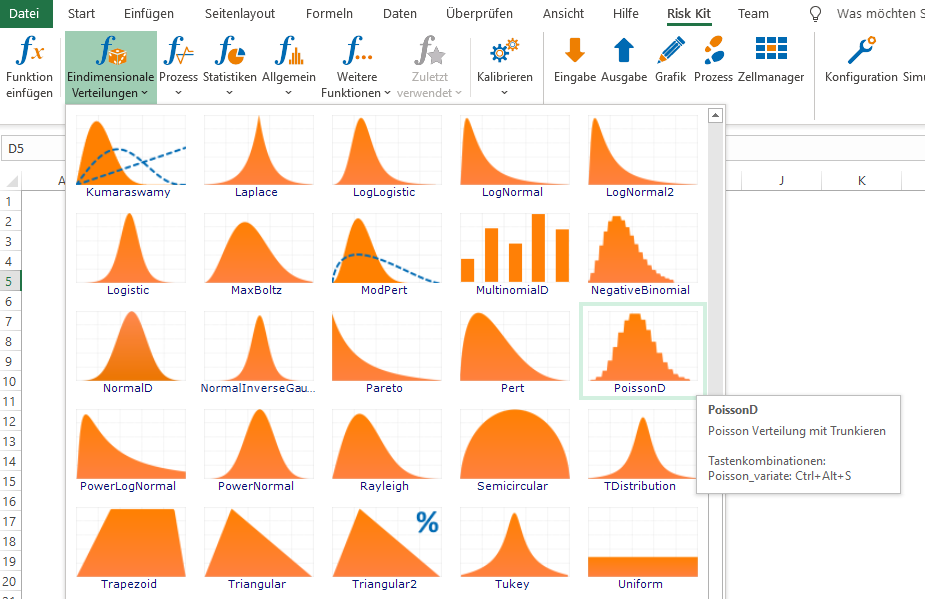
Figure 7: The Poisson distribution on the Risk Kit ribbon
It is parameterized using the expected frequency of occurrence lambda of the risk. This is a major advantage of the distribution in the context of the ERM process, because the expected frequency of occurrence is clearly understandable for experts and can therefore be determined on a well-founded basis. As the expected value of the frequency of occurrence, it can also be derived very well from data, if such data is available.
Example: In the wind farm example, the number of calms, meaning low-wind periods of a certain minimum duration, is an important factor for the quality of the site and the profitability of the installation.
The expected number of calms per year can be determined from the weather data of past years.
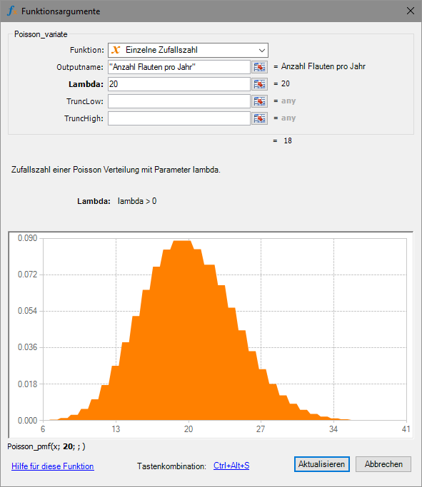
Figure 8: Input dialog for the Poisson distribution
In this example, an important property of the Poisson distribution is that we do not have to specify a maximum number of calms.
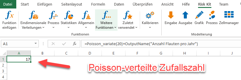
Figure 9: Poisson-distributed random number
The Poisson and binomial distributions are approximately interchangeable in many cases. This is always the case when the expected frequency of occurrence lambda = n * p is small relative to n. The differences between the two distributions are then generally so small that they play no practical role in the ERM process. The two distributions even become identical when, for a given expected frequency of occurrence, n becomes large.
Figure 10 gives an example comparing the two distributions for lambda = 1.5, p = 15%, and n = 10.
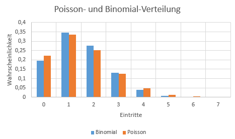
Figure 10: Poisson and binomial distribution compared
Because of these properties, the Poisson distribution is the most widely used model for representing frequencies in ERM.
2. Distributions for the Impact of the Risk
To fully assess a risk, once the occurrence of the risk has been described, the loss amount following occurrence becomes relevant. Here, it is generally assumed that each occurrence causes an individual loss. So if a risk occurs multiple times, the total loss results as the sum of the individual losses. We will go into this in detail in the section on the compound distribution, which evaluates a random number of losses, each of a random amount.
The distribution most commonly used in companies in the past for a single loss event is the constant distribution. This point-shaped representation is often perceived as unrealistic. Attempts are therefore made to replace it with ranges. These ranges can certainly include upside potential as well. Distributions that are often used for this are the uniform, the triangular, the PERT, and the trapezoidal distribution.
All of these distributions are directly related to the classic best-case and worst-case analysis used in business economics, and were originally used to estimate operational risks, that is, operating losses. In these cases, a worst case in the sense of 'tear down and rebuild' is often well defined.
It is different for risks whose impact cannot be so easily capped at an upper bound. What, for example, is the worst case for a pandemic? Some companies have failed precisely at this point in realistically assessing their risks. They did at least include the pandemic in their risk inventory, which most affected companies did not do, but underestimated its impact by a factor of many times over. An error like that quickly renders the entire assessment worthless.
Distributions often used for this application are the lognormal and the Weibull distribution. Both are extreme value distributions and can therefore potentially take on very large values, albeit with small probability.
2.1. Constant Distribution
Risk management textbooks of the past described a risk using a probability of occurrence and an impact. The impact was a fixed number. This 'constant distribution' is still the status quo in many companies today.
Representing a risk with two values has advantages.
- A risk has a short and seemingly precise profile.
- All risks are standardized. Very different types of risk can be reported well this way.
- Risk quantification appears simple.
- Both figures ('PO and impact') can be plotted against each other graphically. Categorized and shaded with color gradations if needed, this produces the risk map.
In its technical implementation, the constant distribution is so simple that no tools are needed for it. It produces random numbers that you already know in advance, so you never actually have to draw them. It can be represented in Excel by a simple number.
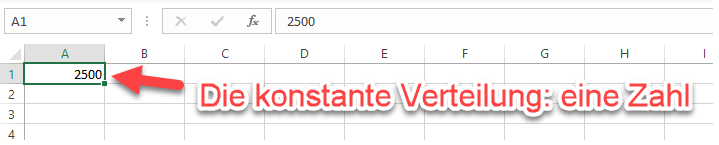
Figure 11: The constant distribution in Excel
On closer inspection, however, describing the impact of a risk with a fixed number often turns out to be a well-meaning illusion. Only for a few risks is the exact loss amount known in advance in the event of occurrence. A pending contractual penalty or the certain replacement of a wear part could be such cases.
In most contexts, however, you can realistically only pin down the impact of a risk as a range, and often as a very wide range.
2.2. The Uniform Distribution
If you follow the paradigm of a range for the possible losses after a risk occurs, the uniform distribution matches this picture in a natural way.
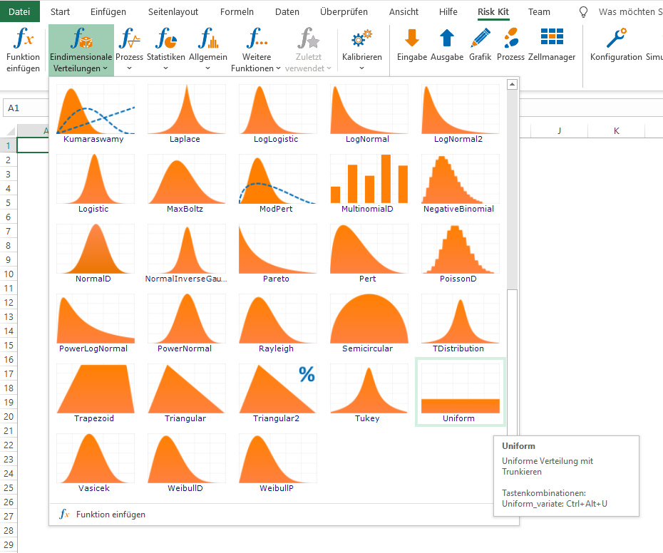
Figure 12: The uniform distribution on the Risk Kit ribbon
It takes values between a minimum A and a maximum B, and its density has exactly the shape of a flat band.
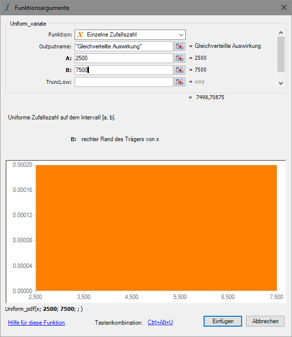
Figure 13: Input dialog for the uniform distribution
Every value between A and B is assigned the same probability.

Figure 14: Uniformly distributed random number
Uniformly distributed random events occur in many games, often in their integer version. The sides of a die come up uniformly distributed. Playing cards are shuffled in a uniformly distributed way. The ball on a roulette wheel selects a number in a uniformly distributed way. Here, the uniform distribution is virtually the epitome of fairness.
We can put this property to use in ERM.
If, in the wind farm example, we have data on the length of calms from past years, we can number the observed data points and draw a number using the uniform distribution. The cost of the simulated calm then results as the length of the drawn calm multiplied by the revenue loss per unit of time.
With this approach, we avoid the need to determine the distribution of calm lengths and can access the observed data directly. However, we will also never simulate a calm longer than the longest observation in our sample.
Other approximately uniformly distributed quantities include the exact spot where a pipeline develops a leak, a rope tears, or a cable breaks.
Even though it captures the picture of a range so directly, the uniform distribution is often not immediately plausible in ERM. One important reason for this is that its density does not develop continuously. Losses outside of A and B have a density of 0. Values in that region are never taken on. But right at A, the density jumps to a high level, stays there until B is reached, and then drops abruptly back to 0.
A more intuitive model would be one in which the region not covered transitions seamlessly into the region where losses occur. This will shortly give us reason to introduce further distributions.
Paradoxically, this very drawback of the uniform distribution, namely that losses at the extreme ends A and B of the value range are assigned an unrealistically high probability, is one reason why it is often used, at least as an interim solution.
For one thing, choosing this distribution can signal that the exact shape of the frequency curve in the loss range is either not known or has not been examined. Something like a most likely value or the more precise shape of the distribution is then simply not known. This makes clear that an approximate solution is being used, the principle of indifference formulated by Pierre-Simon Laplace.
For another thing, the uniform distribution fluctuates more strongly across the value range than the alternatives, triangular, PERT, or trapezoidal. The overall risk therefore becomes more sensitive to this risk factor than if another model were chosen. So if a risk has little influence on the result when the uniform distribution is chosen, this will change little even with a more refined representation of the impact. In that case, the choice of the extreme values A and B is what matters most at first. If they are correct, a more differentiated representation of the impact distribution may well not be worth the effort, and the principle of indifference mentioned above can rightfully be applied.
2.3. Triangular, PERT, and Modified PERT Distribution
The triangular and the PERT distribution are an important alternative to the uniform distribution when shaping the range of possible losses from a risk. Here, the loss curve is structured around three points: the minimum, the mode, and the maximum.
The mode is the peak of the distribution's density. It is also referred to as the 'most likely value', since the probability of observing losses in the neighborhood of this point is the greatest.
Determining these key figures is very achievable, using the questions 'In what range are the losses at a minimum?', 'In what range are the losses at a maximum?', and 'In what range are we most likely to expect to see losses?', even for risk experts who do not normally deal with parameterizing probability distributions in their everyday work. This intuitive appeal is so strong that many companies run their entire ERM using only these two loss distributions.
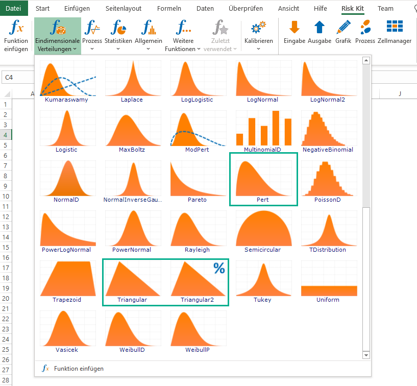
Figure 15: The PERT and the triangular distribution on the Risk Kit ribbon
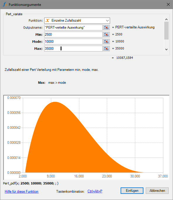
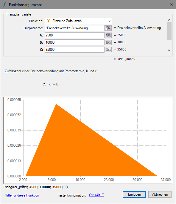
Figure 16: Input dialog for the PERT and the uniform distribution
Figure 16 shows the input dialog for the PERT and the uniform distribution. The same values have been entered, so that the distributions can be compared.
While both density functions take the values 0 and their maximum at the same points, the PERT distribution falls off faster at the long end than the triangular distribution. The maximum loss is therefore taken on less often when using the PERT distribution in this example than with the triangular distribution. With the PERT distribution, by contrast, more probability mass lies near the most likely value.
This difference is often a helpful criterion for determining which distribution fits best in a given situation.
This idea, taking into account the speed at which the distribution tapers off toward the extreme values when choosing a distribution, led to the formulation of the modified PERT distribution.
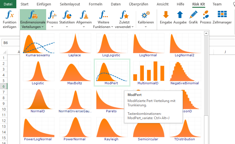
Figure 17: Modified PERT distribution on the Risk Kit ribbon
At its core, the modified PERT distribution is likewise determined by the minimum, the most likely value, and the maximum, but it contains an additional parameter that determines the curvature of the distribution.
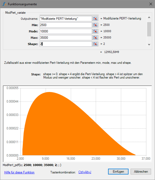
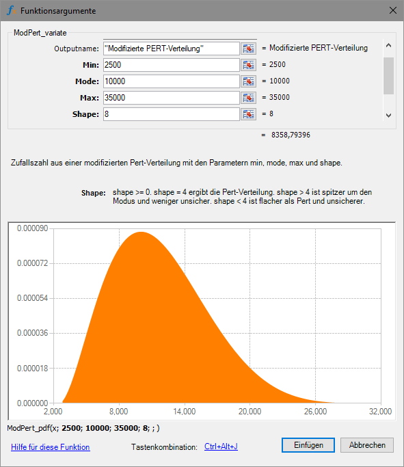
Figure 18: Input dialog for the modified PERT distribution
A shape parameter value of 4 again yields the familiar PERT distribution. For a shape parameter value <4, more probability moves into the extremes, and for a value >4, the probability mass concentrates around the most likely value.
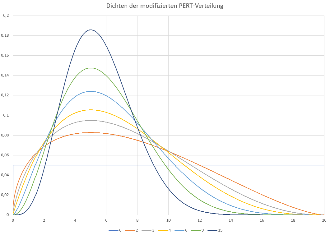
Figure 19: Densities of the modified PERT distribution for different shape parameters
The modified PERT distribution thus spans the entire spectrum from the uniform distribution to a point mass at the most likely value.
Because of this flexibility, the modified PERT distribution can not only be assessed well by experts, but also fits observed data very well, when such data is available.
In the wind farm example, data on the length of calms is available, for instance. The measurements supplied are filtered for a minimum length of 2 days.
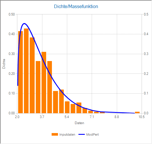
Figure 20: Fitting the modified PERT distribution to measured calm lengths in days
Even though they are intuitive values, the minimum and maximum are not always easy for experts to determine in some situations, because it is not always possible to imagine everything that could go wrong.
By comparison, it is often easier to retreat to the range of firsthand experience and leave the extension of the value range to extreme events up to the distribution itself.
As a first step toward following this idea, there is a second parameterization of the triangular distribution in which the most likely value is specified along with a range around it that will not be exceeded with a given probability. The distribution is then extended out at the sides into a complete triangular distribution.
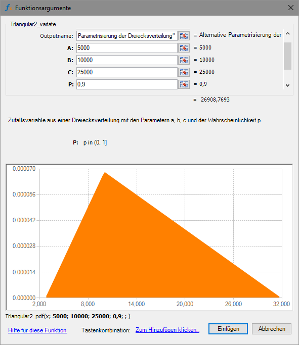
Figure 21: Alternative parameterization of the triangular distribution
In this example, 90% of the probability lies between 5000 and 25000. The distribution therefore takes on values overall between roughly 3000 and 32000.
Overall, this results in the following function calls for the distributions.
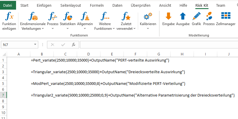
Figure 22: Calling the random numbers
2.4. Trapezoidal Distribution
A variant of the triangular distribution is the trapezoidal distribution. Instead of a single most likely value, it has a most likely range of values.
The trapezoidal distribution therefore opens up more room to describe a 'typical case' for the losses that occur. You do not have to commit to one specific value as the most likely value, but can instead argue that a certain range between the extremes of the overall bandwidth is the most representative of the loss events actually seen in practice in connection with the risk.
In this way, the trapezoidal distribution combines the advantages of the triangular and the uniform distribution.
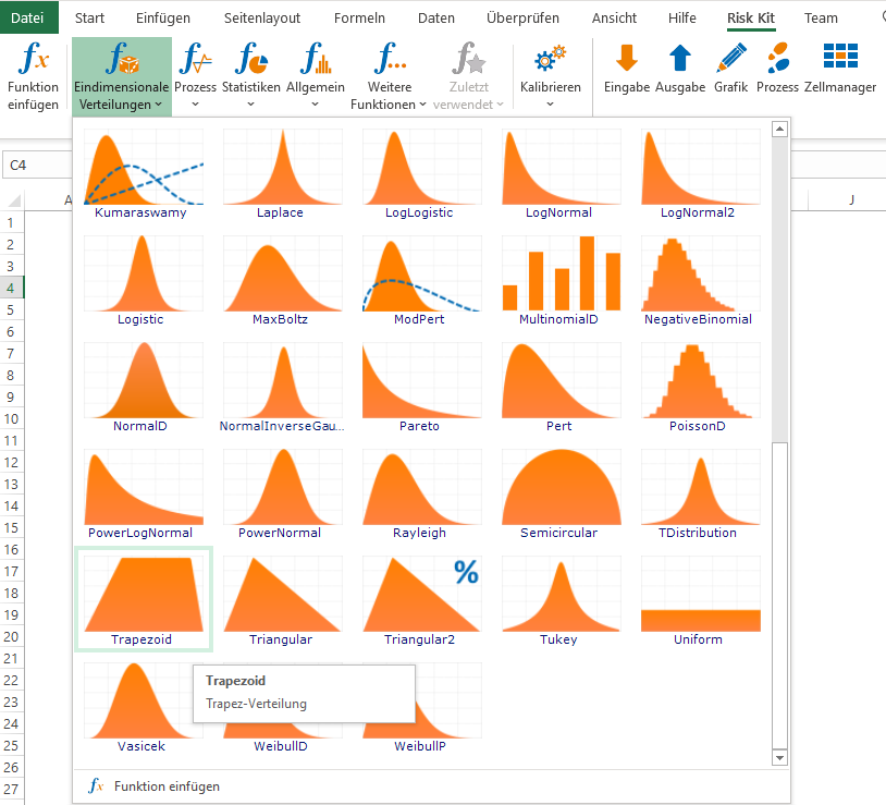
Figure 23: Trapezoidal distribution on the Risk Kit ribbon
To delimit the most likely range of values, the trapezoidal distribution therefore has a fourth parameter: minimum, start of the most likely range, end of the most likely range, maximum.
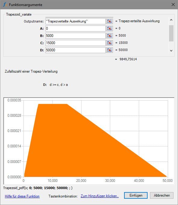
Figure 24: Input dialog for the trapezoidal distribution
In this example, losses between 5000 and 15000 make up the most likely range.
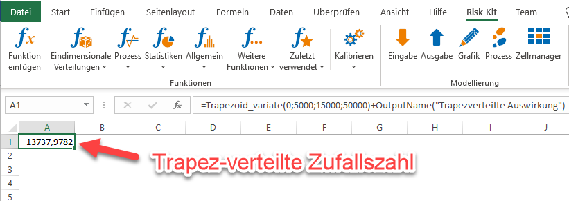
Figure 25: Trapezoidally distributed random number
2.5. Custom Distributions
Another variant of the triangular distribution is the custom distributions. With these, the shape of the loss curve can be drawn individually. Special features of the curve, for example for IT risks, can thereby be represented appropriately, which would generally not be possible with the triangular distribution alone.
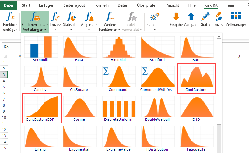
Figure 26: Custom distributions on the Risk Kit ribbon
Cyberattacks are a frequent event in many companies. Their loss patterns, however, are a challenge to represent in ERM. They effectively split into two regimes. Most of the time, losses are very small and can be represented well using the triangular distribution within a narrow range. In rare cases, however, the same risk has far more dramatic consequences and takes on large values with small probability.
With the individually definable distribution ContCustom, representing this risk is possible in a natural way. The density can be drawn point by point. We can therefore extend the familiar triangle to the right to include the large losses.
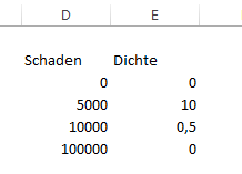
Figure 27: Point-by-point description of the density
Risk Kit scales the density values so that they have the necessary mathematical properties, for example so that the area under the curve represents 100%. We can therefore limit ourselves to describing the proportions of the curve.
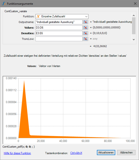
Figure 28: Input dialog for the custom distribution

Figure 29: Custom-distributed random number
The second custom distribution (ContCustomCDF) is conceptually built the same way. The only difference is that, instead of the density, the cumulative distribution function is drawn point by point, starting from 0 up to 1.
All of the loss distributions discussed so far have in common that their value range is fixed and bounded. A parameter for the maximum is explicitly specified. No loss is ever simulated above the maximum.
Specifying the maximum is therefore critical information for all of these distributions. If it is specified incorrectly, precisely the large losses will be systematically over- or underestimated.
In cases where the maximum loss is not precisely known, it can therefore be helpful to use distributions that are 'open at the top'. In this context, the normal, the lognormal, and the Weibull distribution are therefore often used.
2.6. Normal Distribution
The normal distribution is certainly the best known distribution among the general population. It owes its prominence to the former 10 Deutsche Mark banknote, on which it was depicted together with the famous mathematician Carl Friedrich Gauss, who gave a formal definition of the distribution in 1809.

Figure 30: The normal distribution on the 10 Deutsche Mark banknote
In fact, the normal distribution is encountered more often in everyday life, hence the term 'normal' in its name. Many measured values fluctuate in a bell-shaped pattern around a mean.
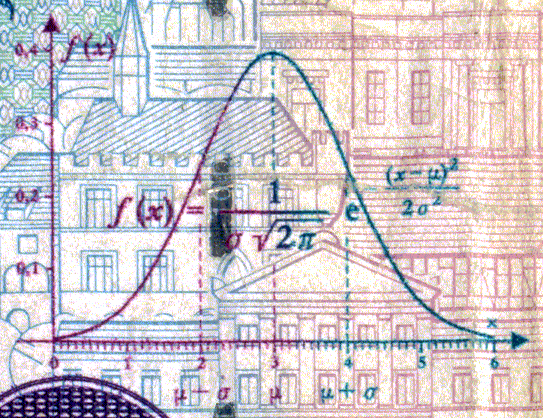
Figure 31: The bell-shaped density of the normal distribution
In addition, sums of random variables are approximately normally distributed under very general conditions, the central limit theorem. It is therefore not surprising that we see bell-shaped frequency patterns in many situations, including in ERM.
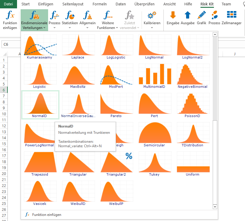
Figure 32: The normal distribution on the Risk Kit ribbon
An important property of the normal distribution is its symmetry around the expected value and its bell shape. As a result, its ability to adapt to special patterns of impact is clearly limited. Its shape is essentially fixed.
In theory, the normal distribution takes on values across the entire real axis. At first glance, this makes it look well suited to capturing large risk impacts. In practice, however, this does not work, because its density goes to 0 so quickly that deviations from the expected value of more than 4 to 5 standard deviations are so rare that they play almost no role for most risk measures, if they occur in the simulation at all.
The normal distribution is thus an example of a distribution that looks unbounded but is not. Combined with the rigidity of its shape, this is one reason why it is used in ERM only for very specific risks, above all for price change risks in interest rates, exchange rates, commodities, and other market factors.
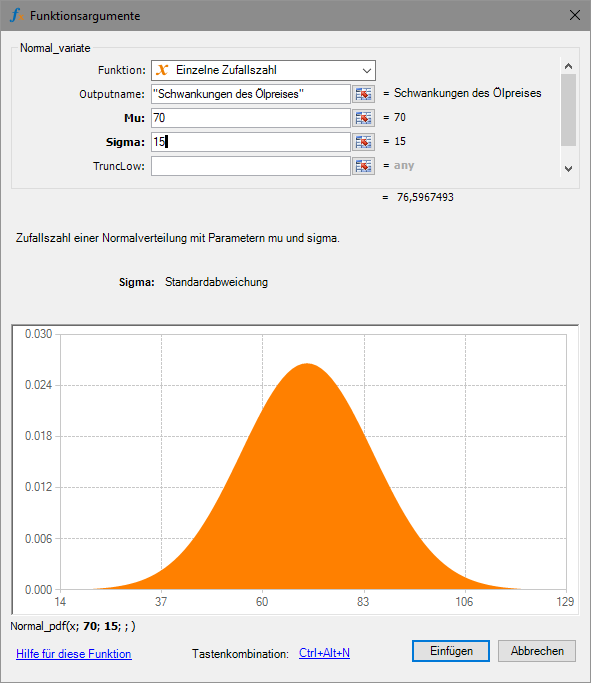
Figure 33: Input dialog for the normal distribution
Figure 33 gives an example of using the normal distribution to describe oil price fluctuations. This application is covered very comprehensively in Risk Kit, since with the Risk Kit Data extension you even have the option to load market data directly from the ECB and other institutions, prepare it, and evaluate it1.
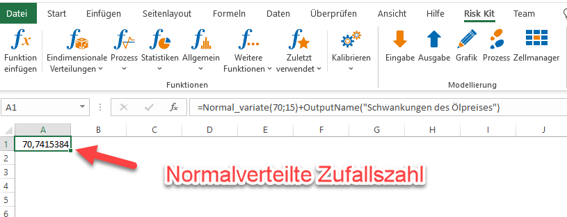
Figure 34: Normally distributed random number
2.7. Lognormal Distribution
A variant of the normal distribution that is far better suited to describing exceptionally large losses is the lognormal distribution.
Starting at 0, the lognormal distribution only takes on values on the positive real axis, but can then extend very far upward.
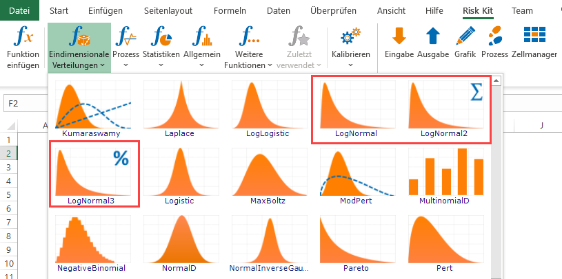
Figure 35: The lognormal distribution on the Risk Kit ribbon
It embodies the case where the risk usually results in only a small to medium loss, and only rarely in a large to very large loss.
For the lognormal distribution, Risk Kit offers three parameterizations to choose from. First, the textbook parameterization (LogNormal), in which the expected value and standard deviation of the underlying normal distribution are specified. This representation is very difficult for users to control, since the e-function plays a role in the transformation from normal to lognormal, meaning the values in the simulation can easily explode. This parameterization fits best when the distribution is calibrated to data.
LogNormal2 makes it possible to specify the expected value and the standard deviation of the lognormal distribution directly. These values are in the same unit as the random numbers, so you have a lot of control over the order of magnitude you specify. The difficulty remains that experts can picture very little under a standard deviation, so an element of uncertainty remains.
LogNormal3, finally, defines the distribution via its expected value and a quantile. Experts can therefore focus on data from their own area of experience when pinning down the distribution precisely.
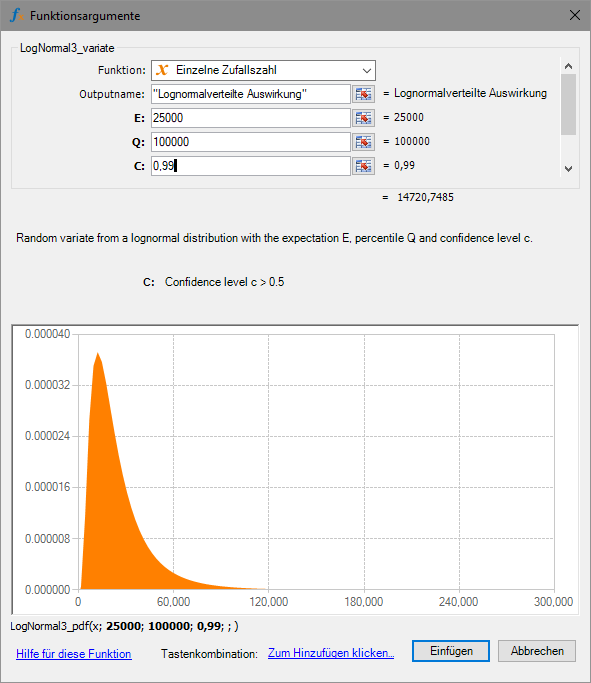
Figure 36: Input dialog for the lognormal distribution
The example above shows that large values are within the realm of possibility for the lognormal distribution. With an expected value of 25,000 and a 99% quantile of 100,000, values up to 300,000 are something you will occasionally see in the simulation.
This visual feedback is very advantageous when working with the lognormal distribution, because it shows you the value range that comes with the parameterization you have chosen.
Risk Kit also offers a feature that lets you cut off loss values that would exceed any realistic bound: truncation. Through optional truncation at the bottom or the top, a boundary is built into the distribution that will not be exceeded in the simulation.
In the example below, the boundary at the upper end has been set at 250,000. The loss range above that therefore no longer plays a role.
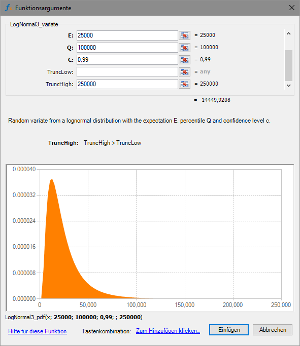
Figure 37: Lognormal distribution with truncation

Figure 38: Lognormally distributed random number
2.8. Weibull Distribution
The Weibull distribution can be used in a similar way to the lognormal distribution. It, too, only takes on positive values and leaves room for large losses.
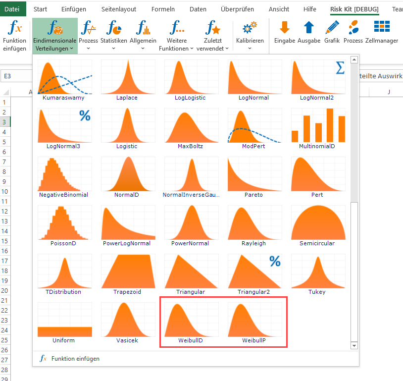
Figure 39: The Weibull distribution on the Risk Kit ribbon
For the Weibull distribution, Risk Kit offers two parameterizations. First, the textbook representation (WeibullD). A is a location parameter that can be used to shift the distribution left and right, and is at the same time the minimum of the distribution. B and C are shape parameters that cannot be determined through expert assessments. This parameterization is therefore only suitable for calibration against a data basis.
The second parameterization (WeibullP) uses the same location parameter A along with two quantiles to describe the distribution. We can therefore determine the distribution by specifying its minimum along with two further limits that will each be undercut with a given probability.
For example, we can assume that the loss will be positive (A = 0) and will remain below 35,000 with 75% probability and below 100,000 with 99% probability (P1 = 75%, Q1 = 35,000, P2 = 99%, Q2 = 100,000).
The upper tail can then extend beyond that. Here, too, it makes sense to visually check the practically relevant value range of the distribution and, if necessary, apply truncation at the top.
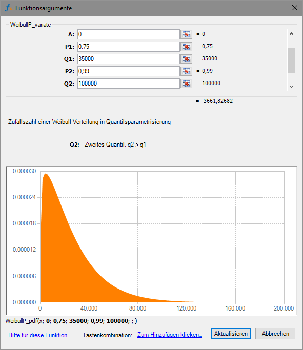
Figure 40: Input dialog for the Weibull distribution

Figure 41: Weibull-distributed random number
2.9. Automatic Calibration of the Distributions
For all of the distributions presented, there are parameterizations that experts can carry out. This is an important prerequisite for their use in ERM, because specific situations often need to be assessed.
In principle, for all of the distributions mentioned, there is also the option of letting Risk Kit carry out both the selection of the distribution that best fits the data and the determination of the corresponding parameters, provided a data basis is available for the risk that can be analyzed.
Data is routinely available in many risk areas, for example for weather and climate risks, cyber risks, market risks including commodity procurement, and so on. It can therefore be worth checking whether a data basis can be established for the general situation in which the risk is embedded.

Figure 42: Calibrate on the Risk Kit ribbon
You can open the calibration dialog for one-dimensional or multidimensional distributions from the ribbon. There, you first point to your data basis and then select the distributions you want to include in the analysis.
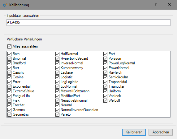
Figure 43: Calibration dialog
Two strategies are recommended for selecting distributions. First, you can allow exactly the distributions that you know well and where you know what you will get. In general, it is advisable to work only with distributions that you know.
Second, you can also select all of the distributions to see whether a distribution you are not personally familiar with might fit the data very well, and whether it might be worth getting to know that distribution better.
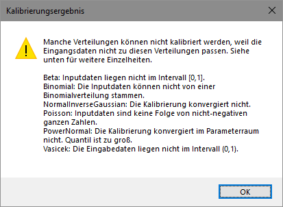
Figure 44: Distributions incompatible with the data
If you have chosen distributions that clearly cannot fit the data at hand, those distributions are removed from the list, and you receive a corresponding message.
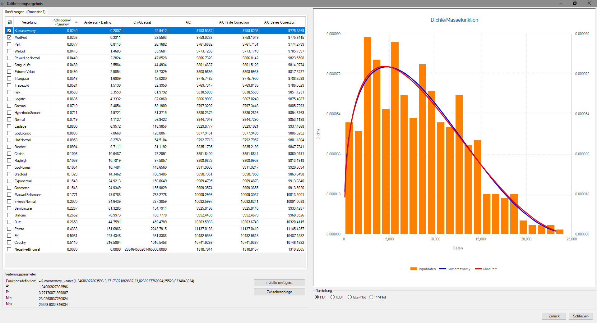
Figure 45: Calibration result
Finally, you receive the calibration result, with a precise representation of how well each distribution fits the data. You see the fit visualized and expressed as numbers in the form of distance measures. For every metric, the rule is: the smaller the value, the better the fit. The list is sorted in ascending order.
The universe of distributions in Risk Kit is altogether so extensive that there are often several distributions that fit a given data set well. Beyond the mathematical grounds for the fit, this lets you also take into account how familiar your organization is with the distribution and how well it can work with it, whether the distribution and its parameters are easy to communicate, whether the value range of the data is respected or extended, and so on.
You can also use calibration in combination with expert assessments, for example by pre-calibrating the distributions on the data and then continuing to build your argument on that basis.
It may be, for example, that the data does not include certain large losses and therefore paints too optimistic a picture of the situation. Experts know this and can correct for it.
2.10. Compound Distribution
The loss distributions discussed so far give the loss for a single occurrence of the risk. In the case of multiple occurrences, a loss must be simulated for each individual occurrence, and these values added together, to obtain the total loss from the risk.
Solving this in Excel involves additional and quite considerable effort, since the number of occurrences can differ in every simulation run. To simplify this and make it manageable, there is the compound distribution, which takes over the evaluation of a risk for the combination of frequency of occurrence and loss distribution and carries out the loss aggregation for that risk.
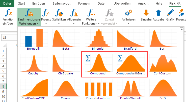
Figure 46: Compound distribution on the Risk Kit ribbon
The compound distribution links two distributions, hence the name. The frequency distribution is evaluated once in a simulation run. The frequency of the risk's occurrence is then known.
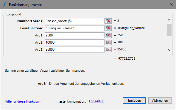
Figure 47: Input dialog for the compound distribution
The impact distribution may be evaluated multiple times by Risk Kit within a single simulation run. It must therefore be specified in a form that makes this possible, namely as the name of the function followed by its parameters. The number and meaning of the parameters correspond to the impact distribution chosen.
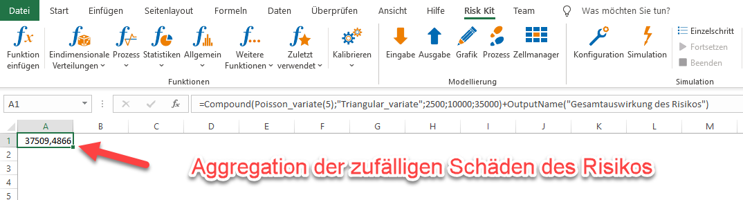
Figure 48: Loss aggregation with the compound function
An additional layer of complexity arises when the losses from the risk are covered by insurance. Policy limits and deductibles can here apply to the individual loss event and/or to the sum of losses per year.
This question is covered by the supplementary function 'CompoundWithInsurance', which takes the properties of the insurance as additional values.
3. Application of the Distributions in ERM
All of these distributions can be used directly with Risk Kit in risk aggregations in ERM and for PS 340. A template model that structures this application and extends it with an evaluation is available on the Risk Kit ribbon under 'Examples: Case Studies'. The model is presented in detail in a video. Small and medium-sized companies will already be able to cover the requirements of PS 340 with this model.
Large companies, whose risk management process encompasses many locations and, as a rule, even country subsidiaries, need a more comprehensive platform to efficiently support risk identification and assessment, action management, and risk analysis and reporting.
The Enterprise Risk Evaluator offers you a modern implementation of a consistently quantitative risk management process. And it is designed to let risk experts take part in the risk assessment process who are otherwise not professional risk managers in their day-to-day work. Contact us to see the Enterprise Risk Evaluator in a presentation.
We deepen the use of Risk Kit, the method of Monte Carlo simulation, and its application in risk management in seminars. Here, the topics and questions of the participants can also be addressed.
For questions and comments, please contact us.
Dr. Uwe Wehrspohn, WEHRSPOHN GmbH & Co. KG, Otterstadter Straße 50, D-68219 Mannheim, Tel. +49 (0)621 146 267 54
Prof. Dr. Dr. Dietmar Ernst, International School of Finance (ISF), Hochschule für Wirtschaft und Umwelt (HfWU) Nürtingen-Geislingen, Sigmaringer Straße 25, D-72622 Nürtingen, Tel. +49 (0)7022 201 1021
1 See an easily readable presentation in Wehrspohn, Zhilyakov, "Live Access to Large International Data Sources with Risk Kit Data. Case Study: Impact of Oil Prices, Foreign Exchange Rates, and Interest Rates on Profit and Loss", 2021, https://papers.ssrn.com/sol3/papers.cfm?abstract_id=3824787